
With the impending iPhone 8 expected to be released with Touch ID display integration, wireless charging, OLED display, and many more mind-boggling features, it’s evident that mobile devices are changing the game in terms of how we as users take advantage of their varying functions. Actually, we really should be renaming smartphones into “geniusphones”.
That being said, one of the most prevalent changes we’ve noticed is how much marketing has changed since the mobile revolution. According to Google,
“…more Google searches take place on mobile devices than on computers in 10 countries including the US and Japan.”
With Google processing over 40,000 search queries every second, you can begin to understand how massive of an opportunity this is for businesses with well-optimized mobile sites. If that’s you, good. If not, let’s explore 5 practices that will help guide you through adopting the best mobile site possible:
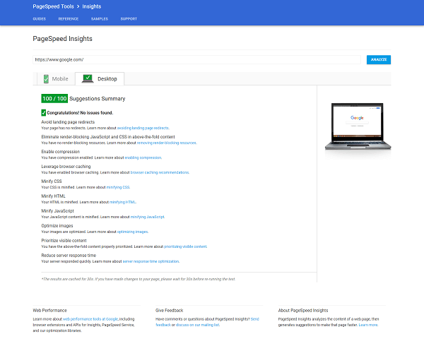
1. PageSpeed Tools
Don’t you hate it when you’re on the go and can’t load that oh so important blog post on the top 10 pet names beginning with the letter “R”? Yeah, well so do consumers. According to Webby Monks:
“More than 40% (of people) will abandon a web page if it takes more than 3 seconds to load…”Don’t be a percentage!
A fantastic tool provided by Google called “PageSpeed Insights” gives users the ability to know their mobile site’s speed, user experience rank (out of 100), and ways in which to improve their site to make it load faster and be more mobile-friendly.
Best put by Aumcore, “PageSpeed (offered by Think with Google) is straightforward, user-friendly and best of all – free! Simply plug in the URL of the website needing to be tested, and PageSpeed generates immediate ratings for mobile and desktop versions, with the option for a full report on areas which can be improved on each.”
Go ahead and try it out, it’s free! Just don’t cry if your mobile site ranks awfully low, instead try consulting with a mobile SEO company that can guide your business to success.
2. Mobile-Friendly Test
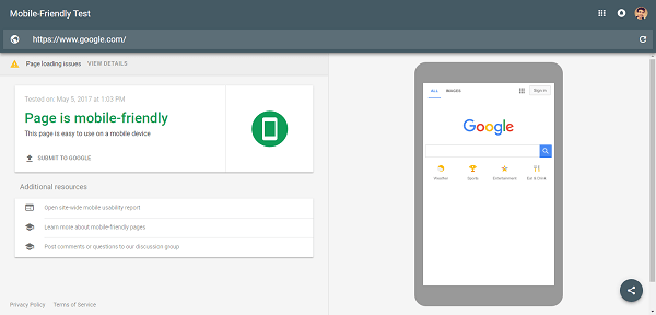
Google really kills the game when it comes to free tools for their users. The next tool on the list is the Google Mobile-Friendly test. Before we get into what this does, let’s first take a look into what exactly it means to be a “mobile friendly” website.
As said by Dex Media:
“A mobile friendly website is essentially when your regular website shrinks down to be small enough to display on a mobile device. It looks like a tiny version of your website.”
In other words, it’s a mini phone version of your brand’s website.
The most important aspect of having a smartphone friendly website is optimizing for conversions. According to Spade Technology, “69% of consumers worldwide between 18 and 39 use mobile devices to research products before they buy, and 44% use tablets.”
On-the-go smartphone usage is the future of how people use the internet. Make sure your business is not only “friendly” towards those consumers, but also welcoming them with open arms.
3. Google Mobile Website Speed Test
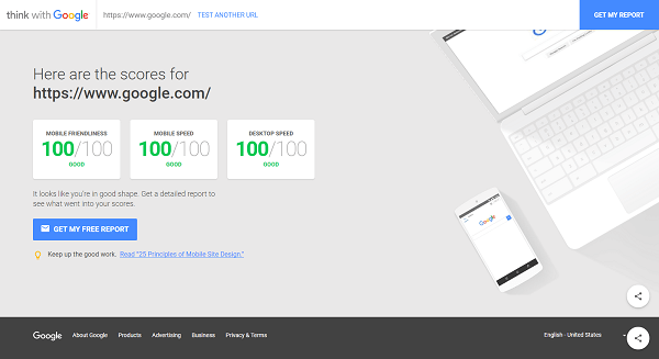
Speed is everything today, especially in the world of Mobile SEO. Understanding your web pages and how fast they are crucial aspect parts impacting your user’s experience on your site. After all, a few seconds delay could be the difference between a high bounce rate and a happy customer.
That being said, isn’t Google just… awesome? Another great tool provided by the tech giant is the Google Mobile Website Speed Test. Don’t be fooled by the name, this tool also has a mobile friendliness test (similar to our previous tool) and a desktop speed test:
- Mobile-friendliness: True to its name, this tool can be used to get a sense of how your users will interact with you site. This means navigable pages, proper font size, tappable buttons, and more.
- Mobile Speed: An easy one, this tests how long it takes your site to load on a movie device.
- Desktop Speed: An extra for this mobile-centric tool, the desktop speed test does just that, it test your site’s speed on a desktop computer. Considering that 90% of consumers who started purchasing a product on their phone switched to a laptop, mobile speed isn’t the only thing you should be thinking about.
4. Mobile SEO Page Analyzer

A beautifully engineered tool from the developers at Pure Oxygen Labs, Mobile SEO Page Analyzer offers your business a complete solution for achieving the most intuitive cellular experience for smartphone or tablet users.
Being a paid service, you get the most bang for your buck. This tool provides you with a substantial amount of analysis and checks in order to ensure that your brand’s website is sufficiently friendly for smartphone viewers. Some of these functionalities help your business configure headers and page redirects correctly, ensure that page weight and download speed are efficiently served, and of course, fix link tags.
Spending a little bit of money can go a long way in establishing a strong web presence.
5. Varvy Mobile SEO Issues Tool
The final web gadget we will discuss is one provided by Varvy. Simple, yet elegant, this tool allows you to easily enter your webpage’s URL, and from that you receive a few reports regarding your website’s structure and speed.
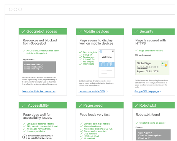
In addition, the report page gives specifics in reference to what could be improved or fixed on your mobile website.
Wrapping it Up
To be the best, you have to look the best.
In today’s market, users are smart in realizing whether or not a page’s usability is practical in achieving that business’ specific goals. It can be anything from selling a good or product through ecommerce to promoting a service.
In order to look good in the eyes of your consumers, your brand needs to have a strong web presence for both desktop and smartphone/tablet users. Check out some of these tools and watch as all of those new business leads come knocking at your (virtual) door.


Tell us your thoughts in the comments