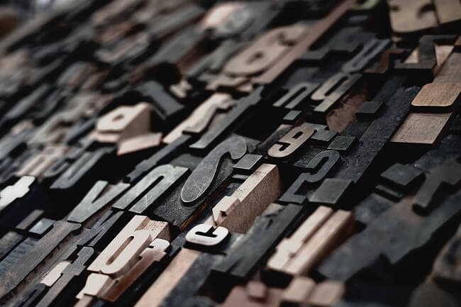
Typography is a huge player in design. The same way different colors evoke different emotions, different fonts express different attitudes. Serif fonts are modern, sleek, and clean. Sans-serif fonts are more traditional and formal. Expressing your company through typography, truly, says a lot about your brand.
In web and mobile design, typography is the art of arranging text and interfaces to make all copy readable, legible, and scalable for the target audience. Attractive fonts even sometimes attract the attention of users and increase the interaction rate of the interface significantly.
2022 Trending Fonts
Choosing the right type of font and deciding what is best for your brand or design often requires you to search the web, which can be time-consuming. What types of popular fonts are there?
So, to help you out, we’ve listed the ten biggest trends we’ve seen growing in popularity throughout 2022.
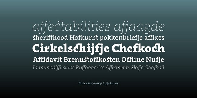
1. High Contrast Serifs
After a long period of minimalism and the fire of sans-serif, many designers have started to give their designs a charm by using high-quality serifs. The large difference in thickness between these fonts gives it a certain sense of quality and a premium product experience that would be difficult to achieve with modern serifs. Let’s be honest, they look good, don’t they?
2. Neue Nouveau
This natural look has an exotic vibe and gives your design a modern feel. It is often used in natural tones and floral decorations. It takes you through the Renaissance period.
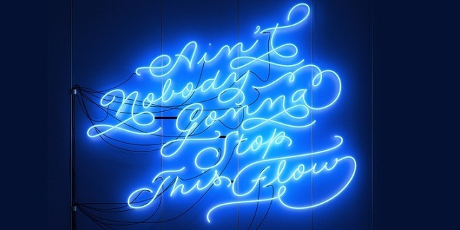
3. Script / Handwriting Fonts
Flexible font styles offer many possibilities for use. Whether you want to give it a prominent role in your design by adding it to your product name, advertising title, or logo, you can also use it for a small insert that gives your design a similar look.
4. Flux
Different fonts are an important part of this style, and it is now possible to manually change the weight and width of the font. You no longer have to choose between predefined fonts in the text format but use the space available to fill the entire screen.
5. Modern Organic
When using a grid to help organize things, the Modern Organic, or “Organic-Mod” font makes the boundaries of what is possible in this grid and avoids getting “too random.” and organic. Readability is an important part of writing, but in some cases, you can sacrifice it a little to create a headline that grabs your attention.
6. Retro Fonts
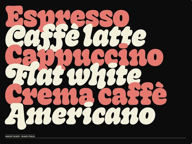
After the big brand changes of the last few years, one thing that stands out is that brands are returning to “better times” and embracing the old days. Whether it is returning to its heritage as Burger King did in its reconstruction from 2021 or the brand that deliberately chose to use this style to guide its new identity.
7. Svelte Serifs
Serifs are often used in a thinner font that gives it a more minimalist look. In addition to fresh and modern character examples, creative clothing styles or modern packaging are inspired. It only works if they give it more characters than a plain font.
8. Modern Geometric Sans
In today’s Geometric Sans font style, there are many different styles, so it’s up to you to decide which one is best for your design, and with this popular typeface, you’ll be sure to find a match.
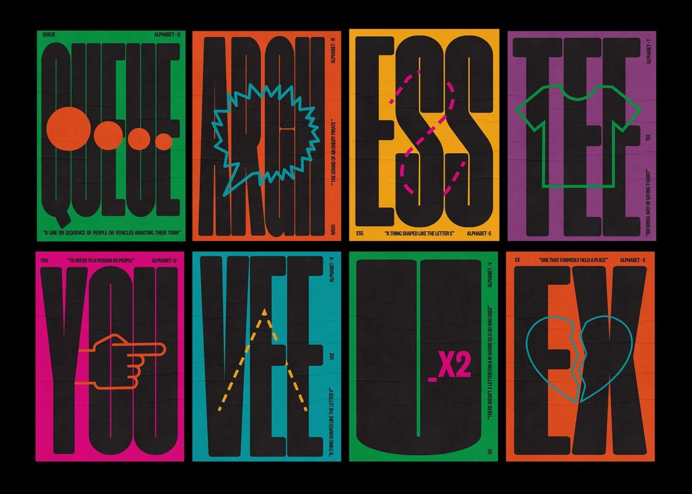
9. Expressive Display Fonts
Some tricks allow us to show off a little and experiment with the fonts we use as designers. With many type designers who have created amazing “state of the art” typefaces, we can work with built-in fonts without creating everything manually. One of the advantages of having font creation software available to a wider audience is the greater choice available for these types of experiments.
10. Loopy
This type of style has a human touch and adds personality to your design by adding unexpected elements here and there or creating a logo that is completely composed of an organic letter system. It brings music, approach, and background to your design and many brands have chosen this direction.
10 Typography Trends in 2023
If you’re a designer, the fonts you use influence the perception of your viewers. Being able to choose the right font for the job is important. in some instances, you want an easy-to-read font. Other times you’re looking for fun or interesting characters. However, it doesn’t matter whether you are a developer or even a writer. Fun new fonts for everyone!
Here are a few trending fonts to look out for in 2023:
1. Core Circus
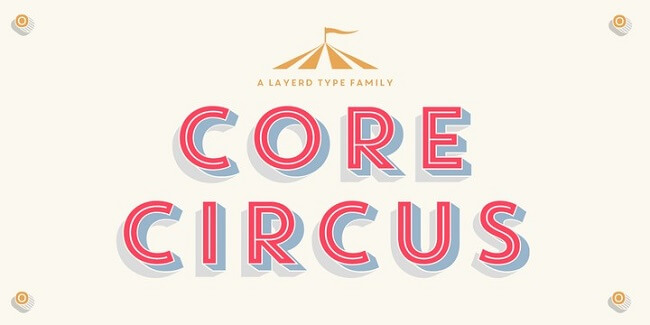
Core Circus is a fun font, one of which has a vertical string to cover inside the alphabet. Members of this family can also have a beautiful shadow that makes them stand out. Core Circus has 20 fonts in its family.
2. Clavo
Clavo is classified as a serif font and has 20 fonts in its family. It entices readers with subtle details, classic looks, and traditional proportions. It is a very readable font.
3. Gentona
Gentona’s goal is to be neutral. It is designed for different applications. It’s a clean serif font that won’t distract the reader. There are twenty fonts in this family.
4. Niveau Grotesk
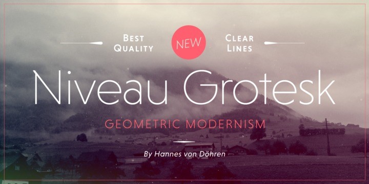
This font family consists of 18 fonts. It’s a professional font, but still fun. Some letters have unexpected and subtle slants.
5. Voyage
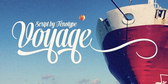
Voyage is a vintage cursive script. There are three characters in this family. The characters are fun and interesting. There are light and bold options.
6. Rolling Pen
Rolling Pen is a font that mimics an ink pen. This font family includes five fonts. Beautiful lines make this font a pleasure to read.
7. Festivo Letters
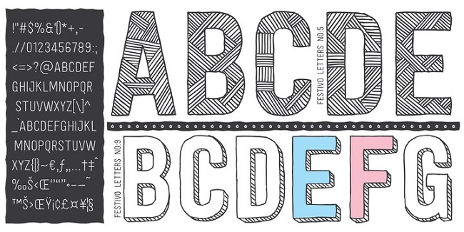
This is a bold sans-serif font. It’s a great font for headers because all letters are uppercase. There are several font styles in this 19-letter family.
8. Aparo
Aparo is a unique typeface that has both thin lines and bold letters. Important lines include details and bring the characters.
9. Zulia Pro
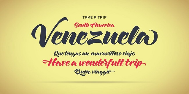
Zulia Pro is a script that emphasizes certain characters and bold curls. This type of font is based on calligraphy and is sure to lift anyone’s spirits.
10. Encorpada Classic
Encorpada Classic is a family of 14 fonts. It’s the serif fonts and unexpected dots inserted into the letters that make them stand out.
Tips to Choose Typography to Express Your Brand Personality
Every business has its unique capabilities and needs, so your brand font should match them as well. Here are a few tips for choosing the right typeface for your brand.
1. Your brand fonts should match your brand identity
Brand quality is determined by many important factors and depends on the type of business you run. You should be able to answer the following questions to gain a complete understanding of your brand:
- What words describe your business?
- How do you want your brand to be known?
- How will you make a difference?
2. Choose a consistent brand font
When it comes to choosing the right font, another very important aspect that you should consider is how the font will fit into your online and offline marketing.
Designs such as posters, brochures, or menus are part of your identity, and your font should be able to adapt well to any format, size, and shape.
3. Make sure your letters are legible
Now is the time to make sure that your selection is 100% legible or your small business will not be able to get the correct identification. But how can we ensure that our font combination will be easy to read in any layout and size? Avoid excessive embellishment.
It’s nice to have a different font and make your logo stand out at a glance. But people need to read what you share with them. It is really important to make sure that your letters are not confusing or even worse – they create new words that are completely different from what you mean.
4. Choose a font with multiple sizes
To help your readers follow your text, it’s important to choose fonts with a lot of weight. This means they have the option of being thin, regular, bold, curvy, and many more. Subscripts will help you highlight key points or make visual connections stand out. This feature should be the most important thing when creating your brand image.
5. Differentiate between your brand elements
A good exercise to do when choosing your font is to create mockups in different combinations and see which one works best. By doing this, you will get a difference between the characters and the result will be more appealing to your customers.
5 Best Fonts for Mobile Website and App Design
Think of typography and fonts as clothes for words. Like wearing scarves in the winter, t-shirts in the spring, and a jacket for hiking, doesn’t it make sense? Following the same train of thought, different fonts will also work better in different situations.
By creating a symbiosis between your design and your fonts, you will create a cohesive user experience. That is why not all fonts are suitable for all types.
1. Open Sans
Open sans are optimized for viewing websites and mobile applications. This font is designed with vertical stress, an open style, and a neutral and friendly look. With these features, the open space gives a pleasant reading experience.
2. Roboto
One of the most popular fonts used by mobile app developers has to be Roboto.
No less interesting is that Google has chosen Roboto as the main font for the mobile system and Android phones. It is because this font has a friendly and open side. This makes reading more natural.
3. Poppins
This font is not only good for reading but also gives a warm feeling to mobile applications.
4. Nunito Sans
Nunito gives a pleasant feeling, which makes the mobile app more comfortable to use.
5. Lato
Lato is a font from the sanserif font family. This font was created by Warsawukasz Dziedzic in the summer of 2010.
Lato in Polish means summer. True to its meaning, using the Lato font will give the mobile app a summery feel.
The Most Used Free Fonts for Digital Web Design
The same way images need to be altered for mobile experiences; fonts must also be tailored to smaller screens. User experience and user interface design is all-important in the age where the main objective is to promote interaction and engagement by users.
Here are the best fonts to use for mobile web and app design:
1. Roboto: This font was actually created specifically for mobile Android usage by Christian Robertson, a Google designer. It was made free for commercial and personal usage in 2012 and is an excellent choice for your mobile content or app design.
2. Montserrat: Julieta Ulanovsky is the designer of this font. She was inspired by signage in a historical town of Buenos Aires and also created this font specially for website usage. This sans-serif font is best for those looking for a minimalistic user interface.
3. Open Sans: This is another Google commissioned font by Steve Matteson. This sans-serif font is another popular choice for mobile devices. The most notable differences between this font and Roboto is the curvature of the letters is slightly different and the width of the letters is thicker.
4. Crimson: This is a retro serif font created by Sebastian Kosch. It was inspired by older fonts like Garamond, Minion, and Baskerville. While it is a serif font which isn’t typically used for digital content, Crimson is a good example of how you can take traditional elements in typefaces and alter them slightly to produce something for the modern eye.
5. Playfair Display: Yet another retro serif font which was inspired by Baskerville! This font was created by a Danish designer named Claus Effer Sorensen in 2011. How this font differs from Crimson is the serifs are sharper and the tips of each letter are more rounded. The font overall is also thinner. This font is good for companies who want to communicate a more elegant style through their mobile presence.
These are some of the most used free fonts for digital and web design. The best part is that all these fonts are free for commercial use!
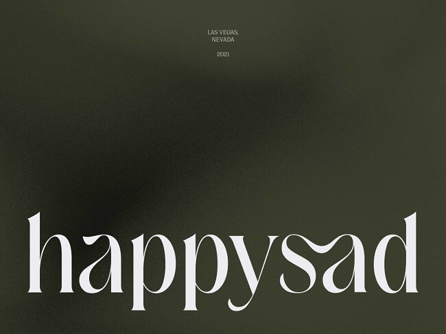
Why Typography Is So Important?
Typography plays a huge role in branding because the font you select influences how your customers see your brand. Different typefaces actively communicate different messages to your users.
Think about how you want customers to view your business and what you want to say through your typographical choices. Big bubble letters have a very different impact compared to tall thin letters. One is seen as fun and playful while the other comes across as more solemn.
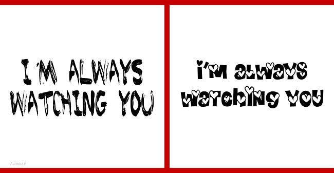
This image is the perfect example of why typography is so important. The same words are showcased on both the left and right sides, but because of the different font types, they communicate a completely different message.
Typography clearly includes many different elements but if you’re wondering how do you define typography? It is the technique and design of producing different typefaces.
Final Thoughts
Typography trends are always evolving. Just like fashion, some trends come and go with different seasons and others are everlasting. To ensure you’re making the best typography decision for your business, don’t be shy to send out a survey to your consumers if you want to have a data driven approach to web design.
Their feedback will show you how users currently perceive your brand and from there, you can alter your typeface as necessary to steer consumers in whatever direction you want!
Before you go, here are the key takeaways one more time:
- Typography is important because it’s part of your brand’s messaging
- Different fonts evoke different emotions and have different impacts
- Use hand-drawn typography if you want to appear approachable
- Use bold font typefaces when you’re looking to make a statement
- Outlined sans-serifs are for when you want to emphasize titles and keywords in a more modern fashion
- Rounded sans-serifs have a more elegant feel to them and are great for flyers
- Serif and sans-serif combinations help communication informational hierarchy
- Serifs have a more refined and authoritative messaging
- Retro fonts communicate the seriousness of older serif fonts but in a new and more whimsical way
- Variable fonts are great for showing off your technological savviness
- Continuous line art is for those brands looking to maintain a contemporary and minimalist image
- Maxi fonts are great for email imagery
- Sometimes the best fonts are free and used for mobile design


Tell us your thoughts in the comments