Humans are visual creatures. We are attracted to bold, striking designs by nature. That being said, it only makes sense that when it comes to marketing, we need to use a bold approach to generate interest, and more importantly, to make conversions.
A simple and effective way of doing this is through information design. The term may sound complex, but when you take the time to learn all about it, you’ll realize that it is actually pretty simple.
Keep on reading to find out more about information design, as well as how your business can leverage it to improve your conversions tenfold.
What is information design?
The purpose of information design is simple. It’s about communicating information in an easy-to-understand manner. In doing so, brands can develop a seamless user experience which ultimately boosts sales.
The idea is to simplify and share information in a manner that the end-user will be able to understand and relate to. It’s about making sense of data in an ocean of knowledge. It’s about using important data to your advantage and ensuring that your audience doesn’t get lost in translation.
This may sound daunting, and at first, it might be. However, once you understand how to use information design, as well as identify instances in which you are currently using it, you will be able to visualize a way forward for your business.
What is the use and what are the types of information design?
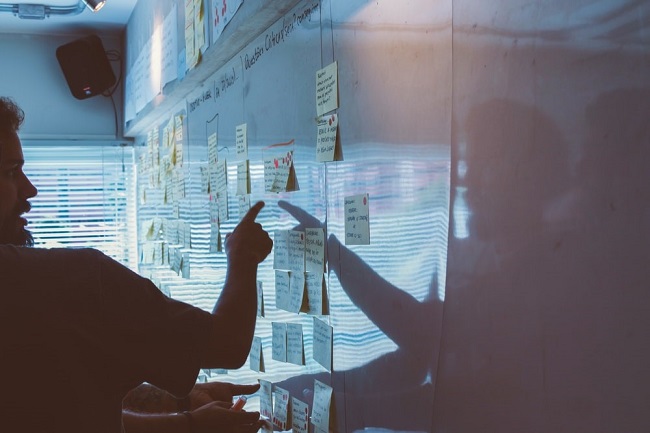
As already mentioned, information design aims to communicate complex information more simply. To do this, there are different types of information design methods that can be used. This includes:
- Bite-sized bits of information like infographics, tutorials and instructional videos
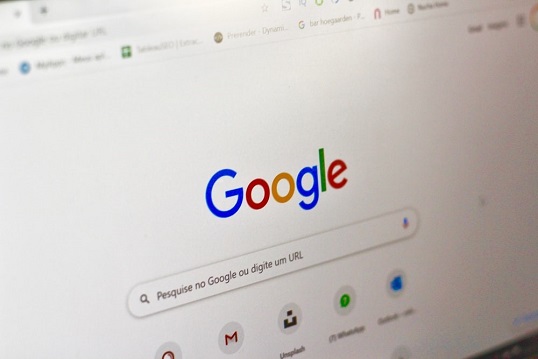
- Searchable information on websites as well as search engines
- Educational resources such as exhibits and microsites
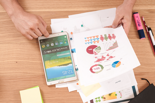
- Curated information like books and infographics
- Wayfinding information like maps and escape routes
- Health and safety content like apps and posters
- Experiential information like window displays and product demos
Information design covers a broad scope of data-related content, and the list of examples could go on and on forever. My question to you is, how many of these designs are you already using, and more importantly, what designs could you see your business taking on in future?
5 Information design principles
When it comes to visual creations, especially in marketing, there are always guidelines to follow. These principles assist brands in developing content that will be well received and achieve the desired results. We’ll break it down for you below:
1. Scale: The size of an element will indicate its importance. So, for example, use a larger font for things that need to stand out. This will draw the viewer’s attention to the most important parts. Simply put, big things are a big deal.
2. Visual Hierarchy: This is a technique that aims to guide the viewer’s eye across the page. This can be done using different colors, values or scale. This ties in with Scale mentioned above, you need to draw focus to where the viewer should be looking.
3. Balance: The elements of the design need to be evenly spread and balanced. This means that you don’t shove everything in one corner and call it a day. Instead, you thoughtfully place each element in a way that’s, well, balanced.
4. Contrast: Use noticeable differences to draw attention to your design. This could be the use of colors, objects or fonts to illustrate the differences.
5. Gestalt Principles: This looks at how humans subconsciously arrange elements to create a whole image. When using this principle, it’s important to look at how everything comes together, filling in the blanks wherever possible.
5 Examples of information design examples
Now that you understand the basic information design principles, it’s time to look at real-life examples that you may not have thought of just yet.
1. Encyclopedias

2. Search Engines
3. Infographics
4. Manuals
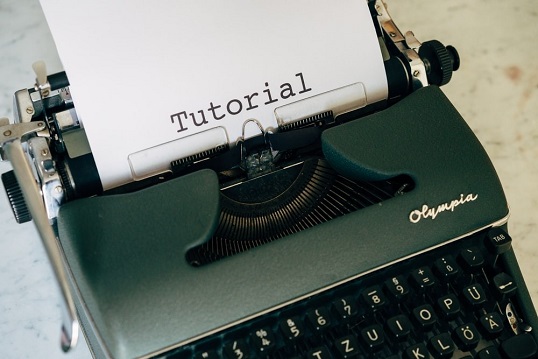
5. How-To Videos
Keep it simple, silly
When it comes to information design, the key is in its simplicity. It’s about being able to communicate something clearly, without boring your audience. It’s about making it interesting and easy to follow, without bordering on information overload.
Yes, it sounds stressful but it’s really not. You simply need to keep it simple. And if you’re not sure where to start, why not give our team a shout?


Tell us your thoughts in the comments