Gone are the days one would simply optimize online web browsing exclusively for our desktops. Now, starting an internet search on a computer is becoming an increasingly backwards way of thinking. With the technology in our smartphones and the amount of savviness our society has developed, mobile devices are now the go-to source for our daily internet fix, and evidently Google has taken notice.
What’s This All About?
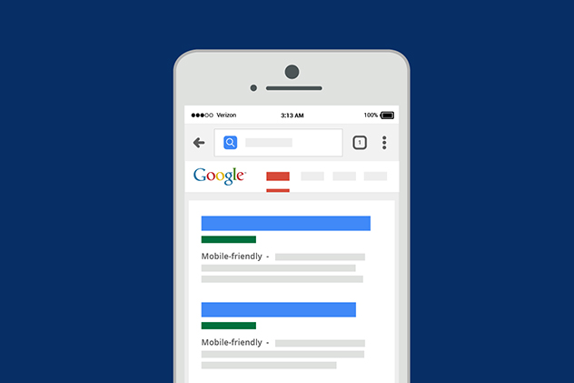
Early last month, Google released an official webmaster blog explicitly stating that the multinational tech company will begin releasing experiments to make their search index mobile-first. As it had previously been since Google started, the search engine would normally rank sites based off crawling though a website’s desktop pages. We’ve been anticipating this change ever since Google announced over a year ago, that a majority of their search engine’s inquiries happen on cellular devices than on computers. The reason for the change as explained in the update:
“Today, most people are searching on Google using a mobile device. However, our ranking systems still typically look at the desktop version of a page’s content to evaluate its relevance to the user. This can cause issues when the mobile page has less content than the desktop page because our algorithms are not evaluating the actual page that is seen by a mobile searcher.”
Basically, Google wants to change to a mobile search index because of the plain and simple fact that more people are viewing websites from their smartphones. The processing capabilities that android and apple phones/tablets now have, allow users to seamlessly browse the internet without thinking twice of switching to their desktops.
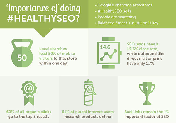
Another key factor to consider in Google’s decision making, Accessibility. Cellular devices are progressively becoming more readily available for people and households of any income. According to Pew Internet, 68% of adults in the United States have a smartphone, which is up from the previously recorded 35% in 2011. It makes sense for Google to be taking this approach, being that as the population becomes more portable, the more the tech company has to cater to the masses. But enough about why the change, let’s explore more in depth as to what this change could mean especially for mobile SEO purposes and what tips your brand needs to remember:
Where Do We Go From Here?
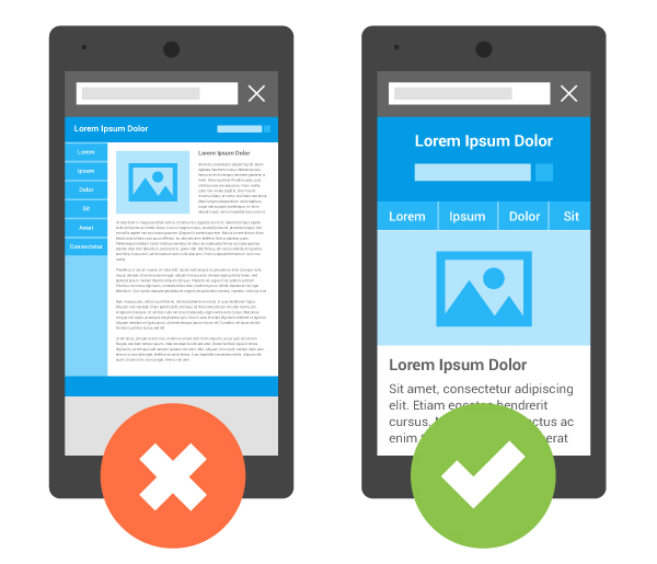
First off, you shouldn’t have to change much if you already have a responsive web design where the primary content and markup is equivalent across platforms. If you’re displaying content differently on your desktop site than you are on its cellular counterpart, just be warned that you’re smartphone site will be prioritized when Google ranks your page. The easiest way to overcome this?
Make sure your mobile site delivers the best adaptation of your brand’s entire digital experience.
This goes back to the theme and approach of thinking mobile first. Google offers a few quick recommendations included with their update post:
- Make sure to distribute structured markup for both the mobile and desktop versions of a website.
- Avoid using large amounts of markup that isn’t relevant to specific info.
- Use the robots.txt testing tool to verify your mobile site to Googlebot.
- Take note that a functional desktop-oriented site can rank your brand better than a broken smartphone version.
Also try making your mobile page’s loading speed as fast as possible. Google’s Accelerated Mobile Pages (AMP) project will continue to benefit brands that are following smart mobile SEO practices.
A few good examples of what an excellent cross-functional webpage may look like is best represented through the global digital marketing agency Aumcore’s case studies. Taking a quick glance at work done with both Unilver and HEOS by Denon, we can learn a few things. One is that content which includes meta tags, heading tags, and internal links should all be optimized for the best search ranking results. We also learn that a good link building strategy can increase popularity and organic traffic growth.
The Takeaway?
Google, either way you want to look at it, is trying to change the internet for the better. With a steadily increasing community of smartphone users in today’s society, it only makes sense for our world to act accordingly. In the eyes of search engines, a more mobile-friendly way of thinking is what we’re were beginning to see and will continue to see as the automation of the internet increases.
Making sure that your brand continues to keep its focus on non-desktop page development is predominantly the best strategy to follow. Further maintaining functionality and responsiveness within the content of your webpage are habits that are guaranteed to bring in fantastic results. Still not sure where to even start with a major website overhaul, invest in a Mobile SEO agency to help optimize your digital footprints for smartphones and tablets alike!


