Google announced on March 31, 2016 that they plan to launch what will be known as Material Design. While Google is known for introducing world-changing updates at a moment’s notice, this is predicted to be the most disruptive of all time. Here’s what you need to know.
WHAT IS GOOGLE MATERIAL DESIGN
So what exactly is Material Design? Google first introduces the concept by defining (quite in-depth) the concept of “material” and what exactly that means in a matter of space and existence. There are rules. Rules which are seen around us, but not always followed in the virtual world. Rules like no two object can exist in the same place at the same time – yet on some poorly designed sites the shadows and layouts may make it appear to be so. The internet is not just the screens on our computers, it is an environment, and one Google means to treat with the utmost respect.
It is a new way of seeing the world of website design, through Google Chrome that is. Which is pretty significant considering over50% of internet usersview the web through Google Chrome as the majority browser, with the next runner up (Firefox) following at under 15%.
The upcoming release of Chrome (version 49.2) will implement Material Design, rendering web pages by default settings across all platforms using Google’s pre-selected design specifications including a restricted list of colors, fonts, and images. This difference will especially be notable in the pre-determined layout of mobile app structures.
The purpose of this update is multi-faceted, and Google explains by stating the purpose to, “Create a visual language that synthesizes classic principles of good design with the innovation and possibility of technology and science.” – Google
In simple terms, here’s what they’re looking to achieve.
VISUAL SYMETRY
The deliberate restrictions of Google Chrome’s Material Design will lend to a more unified appearance while navigating between sites, creating visual symmetry. Elements that you may not even notice apart, will be made into a whole for a more subconscious approach to balance. Think of this as a broad spectrum “template” of sorts that all websites will be viewed through.
UNIFIED USER EXPERIENCE
Not only will the appearance be unified, but the user experience as well. The new Material Design is built to accommodate a variety of users, in a way that is most logically navigated across the internet. Highlighting focus areas, reinforcement of priorities, standardizing importance and user flow via contrast and size are just a few of the ways Google plans to deliver uniformly though all websites being viewed through their browser.
WEBSITE SPEED
Now here’s a repercussion we can all be grateful for. By reducing the number of colors, fonts, optimizing images, and variables over all, pages will be able to render at a noticeably faster speed. 17% faster to be exact according to Medium. With faster loading time, users will be able to navigate even heavily visual sites more quickly, reducing drop rate and increasing time spent on the pages themselves.
HOW MATERIAL DESIGN WILL AFFECT YOUR WEBSITE
Now for the juicy bits – how these changes will affect your website design. While the changes so far are seemingly invasive, think again. There is a reason Material Design is causing waves.
COLOR
Spent hours pouring over exactly what shade is best for your website theme? Sorry – that’s probably wasted (on Google Chrome users at least). The new color palette will now be restricted to 256 colors. If your website isn’t designed around these specific tones – Google will be replacing them with the nearest match. The good news is, 256 colors is a lot more than it sounds, so it’s unlikely you’ll notice too much of a difference. Where it will matter – if you’ve matched some of your fonts to the spot colors of your logo – you’ll want to review these in Chrome after the launch, as they may appear a bit miss-matched after the change.
The same color will apply for images, which may affect the look of your photos. Before you panic, consider this: Though recent advances in technology allow nearly endless colors to display properly across most monitors, the standard list of web safe colors is compromised of only 216 variants.
TYPOGRAPHY
Notice that is singular. Yes, with Material Design, there will be only one universal font, which belongs to Google itself called Noto, designed to support all languages and platforms across the internet, for a truly global approach. From the font and lightness categorizations, to spacing and colors – this is one area where you can rest assured you’ll be noticing some changes. Buttons will have a uniform font size. Headers – same. The level of importance (after determined by Google) will be the same across all websites.
Fonts will say goodbye to color all together, and instead display in various shades of black or white (which will also be determined automatically).
ELEVATION
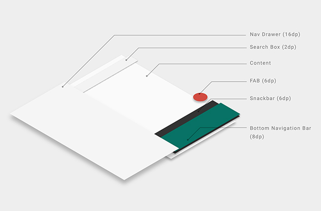
In correlation to the in-depth explanation of “material” given above – those same physical principles will be applied throughout a site. In simple terms: the elements within a website should have a pre-determined depth. This will create an object hierarchy determining how different objects within the site interact with each other in space.
For example, bottom navigation bars and menus will have an elevation of 8dp. Floating action buttons will have an elevation of 12dp. Refresh indicators and search bars 3dp. You can see the full listing in their explanation, but basically this means the shadow (creating the 3D effects on websites) will be controlled through Material Design for a more realistic environment.
These are just the major changes, and further details can be found on their regularly updated log. If your business has the need to display a perfectly uniform design across all platforms and browsers – these are important factors to know and understand… for your immanent website re-design per Google’s new rulebook. If you’re in need of a refresh or planning on a site launch within the next year, be sure to work with an agency well versed in the changes.
#AUMTHINK: WEB DESIGN REBORN
So what will the future hold? Design evolution. It’s not degrading good design, its avoiding bad design by setting a standard in place for which websites will not have to comply to get organized – it will be enforced through the Google Chrome browser system. It’s a visual language. It’s putting to practice the technology that’s available to us into a new standard for unified web existence. Perhaps just the beginning of a wider movement to disintegrate the chaos of a disorganized web space into the distant past. This is the future.
Perfectly put, “… a visual language for our users that synthesizes the classic principles of good design with the innovation and possibility of technology and science. This is material design.” – Google

